Showing posts with label Conventons/Annotations. Show all posts
Showing posts with label Conventons/Annotations. Show all posts
Thursday, 30 January 2014
Photos from Photoshoot 2
I would say more thought was taken into consideration when taking the photos for photoshoot 2. As we were able to use a light that we could manoeuvre around the models and we were in an environment where we were able to use different backdrops. Although both photoshoots used professional cameras, the use of more efficient equipment for shoot 2 made shoot 2 more eye catching and eligible for my front cover.

Photos from Photoshoot 1
In this Prezi we see a few of the photos taken in photo shoot 1. Majority of them won't be used in the magazine as I'll need to take some again and I genuinely don't have enough room for most. They were taken in a different location and with different people to Photo shoot 2. I purposely wanted a different variety of location and people I knew to be involved with the magazine.
Photoshoot 2
The second photoshoot I took consisted of my colleagues Mamuda, Ade and Josh. I felt that they could enhance the magazine in a more positive as they seemed to have more a 'hip-hop/rap look' than the models I had used in Photoshoot 1. The black/white backdrops helped me get very professional pictures that I intend to use in the magazine. From advice of my colleagues, the white backdrop seems to be more sufficient for my front cover, wheras, the black backrop pictures would be more efficient on my 2 page spread. The clothing worked out very well and I'm very pleased of the contributions that everyne made to get these photos. This involved my colleagues and I brnging clothes that we felt would be efficient for this shoot.


My colleagues seemed to like the white backdrop as oppose to the black backdrop. This wasn't the case for my models and I however, who preferred the black. Nevertheless a number of my colleagues have advised me to use this particular photo as the cover photo for my magazine. I like the idea of this and can see the black backdrop photos incorporated into my contents and 2 page spread.

This photo I particularly liked as my model has done an impressive job in connoting the 'serious' look I was going for. Artists in my genre don't usually smile or gleam their teeth they seem to keep a very stern look as we can see. The direct look into the camera with hidden emotion shows professionalism and will definitely be used in my magazine. I feel that the lighting work although there is an evident shadow in the back that I may need to try sort out. However this photo is one of the many that I was very happy with.
Photoshoot 1
I'd like to call this a practice photo shoot as I wasn't particularly happy with what I had done.
My first photo shoot consisted of my friends Wilfred Kiondo and Jamel MacFarlane. I felt that they had the appropriate look of a rap artist that I was going for therefore suited well for my photo shoot. I feel however that these photos will have to be taken again as I'm not particularly happy with the mise en scene involved in some of the pictures. I had taken quite a few photos in this area however these are the few that show the inappropriate mise en scene and position of photo.
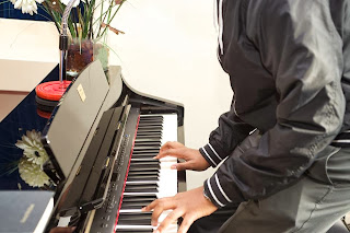
In this photo I am very pleased of the position of my model and the hand gestures made with the piano. However the vase and microphone stand are not giving the best outlook of a rap magazine and in my opinion deem inappropriate therefore this particular picture would have to be taken again. Not showing the face of the model in this picture gives the audience the opportunity to focus more on the piano and not specifically the person playing it. I want my audience to prioritise music and not necessarily the people playing it.. although the people playing them are as important also.

This photo was to signify a rap battle of some sort. I feel that their positions give a really professional touch on a rap battle however yet again, an aspect of mise en scene is not to my liking. I feel these pictures have given me more incentive on what I was doing wrong when taking these. I feel the stances and hand poses are essential to the photo and when I ask them to take it again, I will ask them to do exactly the same poses they did before. The position of the mini stand on the table with the religious cloth on top drives away from the theme rap, which will mean I'll have to take these photos again. I feel, and as told by my colleagues, that this seems to infer that its a Gospel genre rather than Rap

The mise en scene in this photo seems to be non-existent as I've taken it against a white background. I now realise that its clear a door is positioned on the far left which is inappropriate and takes away the professionalism of the photo. The sight of the light switch also gives a sort of 'cheap' look in my opinion... However, due to the colour of the switch being gold and the appearance of the watch connotes wealth in a way and the sight of the door could just enhance the environment he's in.

This photo also happened to have bad mise en scene. I felt that this pose would relate to a similar pose of rap artist Jay-Z that I've found before. I felt it connotes seriousness and business. However some aspects of mise en scene weren't necessarily appropriate. The clothing was alright, however, the posters on the wall and some of the items in the background weren't necessarily appropriate. I'd hope to be able to take this picture again with the
mise en scene improved.
The picture below happened to be what I was going for with the picture above. I told my model to have his hands in a sort of pondering pose but also business like and with this image in mind. I hope to incorporate this specific image when I take the photos again, and when I do I also hope to use Jay-Z as a sort of 'template' and influence for the rest of my pictures.

Tuesday, 17 December 2013
Genre Chosen w/Conventions
 The genre I have chosen will be Hip-hop/Rap. It was initally going to be just Rap, however, I realised that both of them can be intertwined and incorporated together as they are of the same type of music to work around so I deemed it appropriate to choose Hip-Hop/Rap. The conventions of Rap magazines are usually of a ''boy-ish'' area. You rarely find rap magazines with a 'cute' pink and yellow theme unless its a female rapper e.g Nicki Minaj and Azealia Banks.
The most popular magazines of this genre today would be 'XXL' and 'VIBE'. In the past, 'RapPages' was a very successful rap magazine too.
Popular rappers/ hip-hop artists featured can include : Eminem, Nas, Dr. Dre, Ice Cube, Kanye West, Jay-Z.
The target audience is usually for men however its not excluding the other gender. A lot of young adults are usually into hip-hop/rap and would propbably be the steady fans in that industry.
Wednesday, 11 December 2013
Magazine Cover/Contents and 2 Page-Spread annotations
 In this contents page from an issue of 'Q' magazine, there are various features and techniques used to entice and capture the reader as they may browse for favourite artists or significant titles.
The picture of Matt Bellamy from Muse is presumably the biggest picture due to his high status and well-known success. Fans of the band Muse will undoubtedly want to flick to page 48 to read about their loved frontman of the band. Also the very succesful, arguably the most succesful, band 'The Beatles' are included at the top of the mgazine as they will attract a wide range of people due to their famous success from their career. It is logical that the contents are in chronological order as that should be the order the audience view the content in. Musicians like The Beatles, Muse and Mike Oldfield and people like Rick Rubin are essential to this issue of the magazine as they are popular rock cultures.
 The well renowned artist Florence Welsh has been largely placed on the contents page. This is due to popularity or new information about the artist that would attract Q readers attention. Florence is widely known for her successful singles like 'You've got the Love', 'Dog Days are Over' and her hits on successful films e.g 'Over the Love' for 'The Great Gatsby' film and 'Breath of Life' for the film 'Snow-White and the Huntsman'. Also upcoming artist Ed Sheeran is featured int he top left corner as he's becoming an increasing hit with young audiences. In terms of mise en scene, we can see the big '96' in red is smaller than the 'Issue 306' as we can see that the page number representing Florence will clearly get the audiences attention more than the issue number of the magazine. The white background enhances the colour scheme and also makes the artists stand out aswell. The typography is used efficiently also as the spacing, colour and size all contribute to the contents page creatively.
 This 2 Page-Spread of Lupe Fiasco gives a relaxed, calm approach for the reader. The mise en scene makes Lupe seem somewhat mysterious and with more to say which would be explained presumably in th text. The gold watch he's wearing, the gold imprint on his hoodie and the gold colour schemeb represent wealth, success and fame which is what someone of Lupe Fiascos life would have obtained.The specfic words highlighted in the seperate quote at the top also entice the reader as they wouldwant to understand what was the topic of the converstaion to make him say that quote.
Thursday, 5 December 2013


What is a music magazine? w/ conventions
 A music magazine can be very vague to define as there are a wide range of genres that are used. Initially, a music magazine is a magazine used or dedicated to music. Magazines can cover a specific genre of music whether it may be pop, rock, country or classical, all these genres of music appeal to different audiences and attract different kinds of people. In music magazines they may introduce new upcoming artists in that genre or how they are doing on the charts etc. On the cover it is usually a 'star' of the specific genre who will clearly attract that theme of music. It could be Beyonce on a pop magazine, or All American Rejects on a rock magazine. It wouldn't make sense to have Jay-Z on the cover of a classical magazine as that is not the genre of music he participates in.
 .The colour scheme is essential to a magazine as it keeps it ordered and structured in terms of presentation. If the colours were all over the place then the magazine could potentially be tacky and unpresentable and may not reflect well on the magazine ulimately. Whether it be rock or classical, most magazines usually follow a colour scheme. However these colour scheems don't have to stick for every issue. Most magazines usually change their colour scheme all the time depending on the cover star or background.
The layout is usually the cover star/ or model is placed in the middle of the magazine and the puffs and addtional information is placed around the star usually on either side. The issue,price and barcode are most likely to be seen at the bottom right of the cover. The Masthead is the biggest font usually placed acroos the top/middle of the magazine cover. The Masthead would obviously be placed infront of the cover to show the name however the person is placed infront with certain letters showing as it's obvious that to regular readers what the magazine is even with certain words hidden.
The typography is also essential when it comes to magazines. The way text is arranged on a page can affect the magazine in ways the reader may not expect. Putting big names in a slightly larger font next to the cover star invites fans of those people to read the magazine. Font, size, spacing and colour are all essentials when dealing wth this. The size connotes importance in a way as the writing in a bigger font is usually what the readr is most likely to check up on in comparison to less important information that would be in a smaller font like the issue number.
Subscribe to:
Posts (Atom)